Be yourself; Everyone else is already taken.
— Oscar Wilde.
This is the first post on my new blog. I’m just getting this new blog going, so stay tuned for more. Subscribe below to get notified when I post new updates.
Be yourself; Everyone else is already taken.
— Oscar Wilde.
This is the first post on my new blog. I’m just getting this new blog going, so stay tuned for more. Subscribe below to get notified when I post new updates.
In my attempt to improve my competency with Natural Language Processing, I’ve been working on a mini-project in which I obtain insights from tweets. This will help develop my NLP skillset and enhances my abilities in mining unstructured data and obtain insights as a result.
Just a refresher from my past blog. I obtained tweets from the Twitter API using a query. In this particular example, I queried the most recent tweets containing the key word WTI. This acronym stands for West Texas Intermediate the most common US oil commodity. Restraining the query to such a narrow scope will hopefully allow me to focus in on a few key expressions that will help group like tweets together.
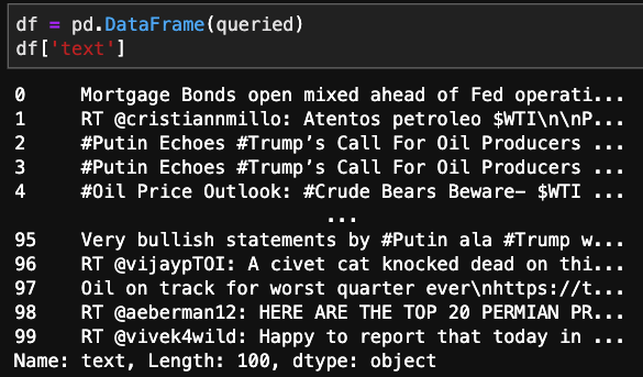
As you can see, there is a bunch of clutter incorporated within the tweet. Whether it be @ symbols, hashtags, or punctuation. There is also a significant amount of words that have no embedded meaning. These will be referred to as stopwords. There will be a number of transformations needed to clean up this raw data.
These are a few of the methods that I’ll use to clean up the tweets.
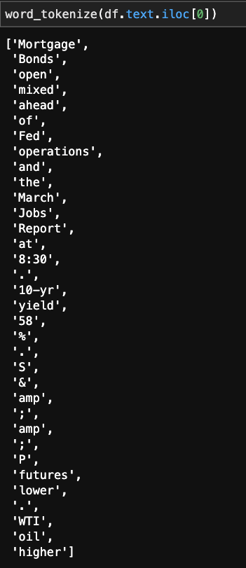
First off, “word_tokenize,” this allows us to split up the text so we can look into which strings are good, and which ones we should dump.
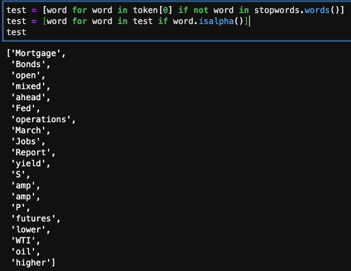
For the same tweet, I’m looking at whether the word in the list is in the predefined stopwords group. If it does, we do not include it in the refined list.
The next line of code checks to see if the string is numeric or actual letters. If it is the latter, it will remain in the list.
Looking at the cleaned up product its not perfect, but it is improved significantly. The next improvement that could be made is to apply stemming or lemming normalize words that have similar endings or different parts of speech. For example:

The Porter Stemmer transform tool when applied to various different types of the word reverts it to the root. Sometimes its functionality is a little off, but as long as it stays consistent, the effects on our clustering will be limited. There are few other stemming or lemming transformations that work in differently, but are unnecessary at this time.
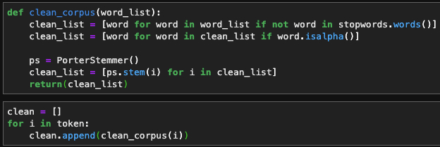
Here I’m packaging the previous methods into 1 function so I can apply it to a list of words more easily.

And there we have it!
Twitter is a plethora of live streaming data, more so when utilizing NLP to gain sentiment. Being able to draw on this resource and enrich models with live sentiment analysis is invaluable, especially when considering how influential people’s opinions and new information matters.
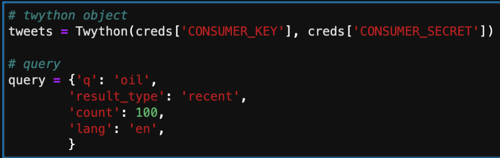
First off, you have to sign in to Twitter to get a dev account where you can build your “app.” This doesn’t have to be something that gets rolled out publicly, but it is simply a medium for you to utilize their API.
After setting up your account, you need to initialize the app, and there will be a set of 4 unique keys that keep access restricted. These should be stored in an external file and imported, otherwise you’re work could be compromised or stolen.

Below, I’m inputing the keys and starting a simple query. There are an assortment of different keys you can pass through to the query. Probably the most important one is ‘q.’ This is where you select your keywords, and filter results. ‘Result_type’ is another important key, that enables the user to pre-filter based on time or popularity.
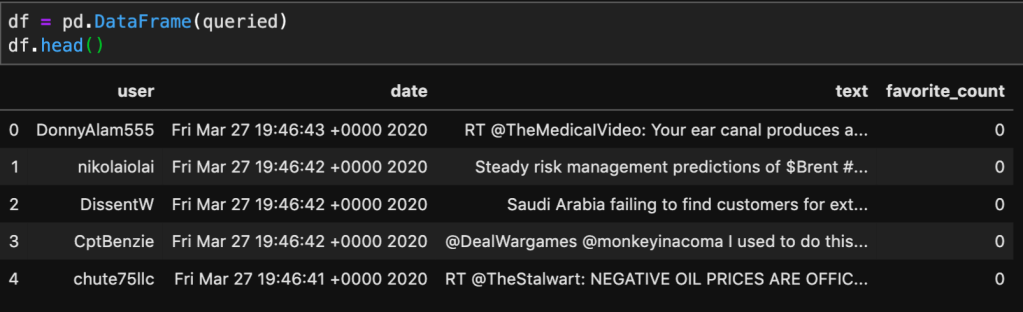
The next step in the process is adding the results of the query by calling the search method. Note that depending on the number assigned to count in the query, there will be that number of dictionaries in the list. Below, is only a part of one tweet. We will need create a subset for what data we actually want to keep.

In the cell below, I am iterating through the search and only taking the user, date, text, and number of favorites. This is more manageable and will give us a clean dataframe to interpret.

Below, I’m taking the queried dictionary and converting it to a Pandas dataframe. This will allow me to now apply NLP to the text column, and hopefully cluster it based on likeness.
This was a simple introduction into how to access information from Twitter. I’ll be working on applying natural language tool kit (NLTK) on this data source, to vectorize and cluster tweets with comparable meaning and sentiment.
One of my projects during my bootcamp was predicting housing prices based on a Kaggle dataset of Ames, IA. I assume (unless you’re from Iowa) doesn’t know about Ames, because its small. I actually went to college at Iowa State University, which just happens to be in Ames, or seemingly Ames was located next to Iowa State University. I digress, being such a small town this dataset was limited to only ~1,400 houses, spanning 6 years, and containing about 80 features. When trying to create a good model, one of the hardest obstacles to overcome is not having enough data, and although there is a large number of features to help fit the model, I was still getting a pretty large error.
My hope, is that by adding additional mortgage rate and housing permit data, I’d be able to reduce this error further.
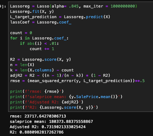
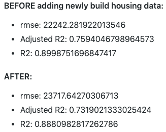
For categorical features, I obtain dummy variables to retain and extract as much information as possible. The resulting number of features, was about 230, and I had a pretty sparse dataframe as a result. For numerical, I applied standardized scaling, and remove outliers beyond 2 standard deviations. As a baseline, I fitted the system with a linear regression model. I had obtained an R2 of .77, but when I looked at the adjusted R2 value it was approximately .55. This led me to utilizing Lasso Regression that would limit the number of non-important features, thus improving the adjusted R2. After optimizing the alpha term, I would improve my results with an R2 of .902 and an adjusted R2 of .76. However, when looking at root mean squared error, I found it to be about $24,016, thus the need for adding extraneous datasets to improve the accuracy.
The rational behind adding this type of data is simple. The higher the mortgage rate, the more people are going to spend over the lifetime of the loan. When purchasing a residence, the total spent over the lifetime of the loan will be drastically higher for a rate of 7% vs 3%.

As you can see, by adding the additional dataset, the R2 and adjusted R2 hardly move, but there is a significant improvement in the root mean squared error, by about $1,800.
The addition of this dataset will hopefully improve the accuracy of the model by tracking the supply and demand of housing in the area. The number of permits being issued will provide a good understanding of how additional dwellings will effect the the price, given the increase in supply.
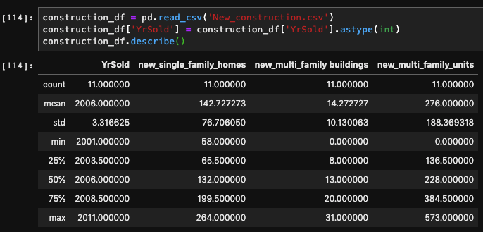
Since the metrics worsen, it appears that this dataset doesn’t improve the predicting power of the model. I believe that this is caused only having yearly data, and maybe if it was more detailed (monthly) that it would provide more forecasting power. I also have my doubts about how influential the issued permits are on the number of residences on the market.
I think more economic indicators, specific to the region, would have some valuable information, such as agricultural prices. I would also like to include the population of the town. This would really help show how the demand for houses fluctuates in relation to demand side of the equation.
I’ve always have had a fascination for the stock market. The idea of being able to own a portion of any publicly listed company is a fascinating revelation for building ones wealth. My first exposure to ‘playing’ the stock market was helping my dad pick out a few stocks for his IRA. A few went down, but more went up and I was hooked. While not the most active trader, I became a dedicated follower of the stocks that I had a faux vested interest in, and would often listen into the earnings reports in hopes of seeing green. I then went to college and pursued a career in engineering, but my facination with the stock market remained.
With my recent career progression into data science, I gained a strong foundation in Python. Upon starting my career search, I stumbled on quantitative trading analytics, and was enthralled in the possibility that I could merge my old passion for the market with my new coding abilities. I figured a good way to get my feet wet in this new area would be attempting to code my own quantitative models for trading assets. Based on popular and established econometrics, I hope that this running series will help improve my understanding of the trading world and my abilities as a coder.
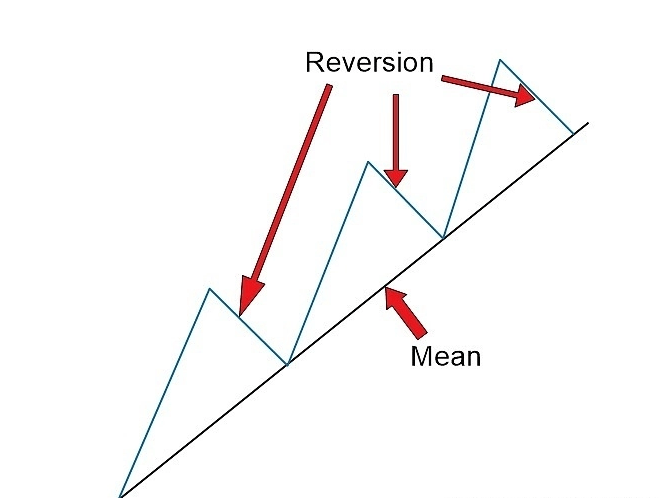
Without further ado, my first project will be on the Mean Reversion Theory.
In its essence, we are comparing moving averages of an asset. When we look at the short term MA if it is greater than the long term MA, then it can be expected that price will drop, or revert, back to the established mean. So I should program the algorithm to short the stock, and profit from the drop. This will also be true for the inverse.
While I was looking up resources for simulating the ongoing trading that would be typical for the application of such an algorithm, I found Quantopian. On the website you’re able to create algorithms and backtest them in a unique environment.
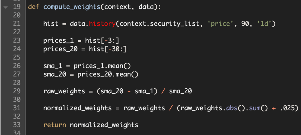
First off, we have to initialize the algorithm. This only gets run once, but it sets up the entire code. This is were we can set up a pipeline to feed an assortment of equities. We can also schedule functions that will be run on set intervals. For example in this script, I am using a rebalance function that will redistribute the funds every start of the week at market open.

Next up in the process I created a function to be used inside of the scheduled rebalance function. I first call up the price history for each security in my list. Then I call slice the prices, based on how large I want the each of the moving averages. In an attempt to normalize the differential between the two averages, I divide their differences by the long term MA. In order to make sure that I don’t over leverage my portfolio, I express these weights as fractions adding up to 1.
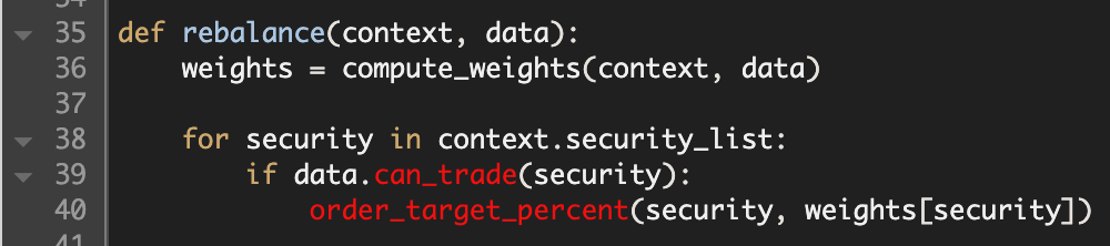
Here is the rebalance function, where I utilize the compute weights function to buy and sell positions. It tests whether the security is still listed. Then it fills the order based on the fractional amount computed by the formula.
The final function, keeps records the history of specific variables that could be informational. In this example, I want to track how leveraged my account is, how many stocks I’m short, and how many stocks I’m long.

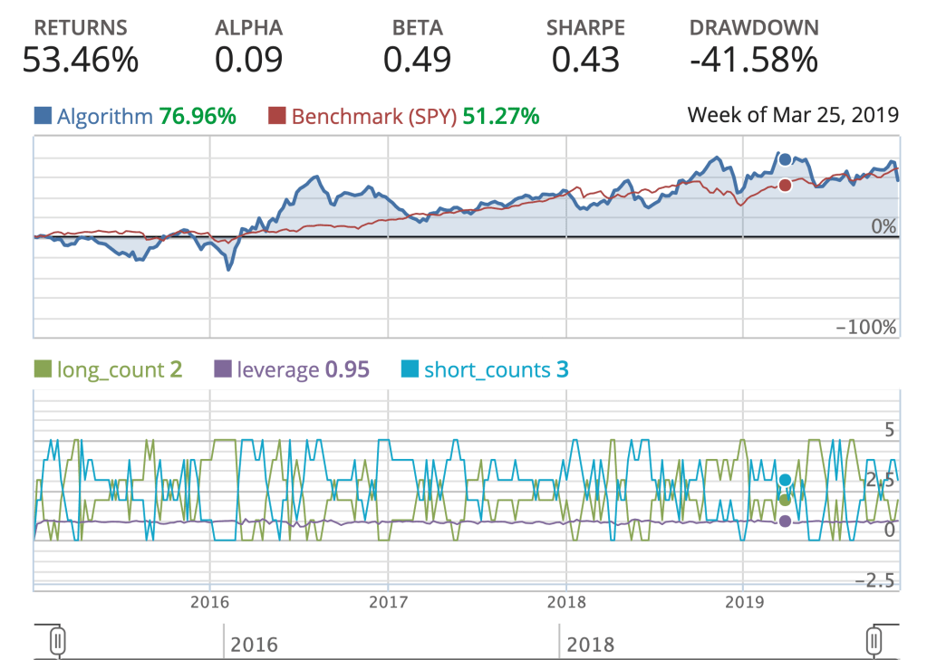
This is now a sufficient algorithm that I can now perform backtesting on, and examine how well it performs based on historical data. This is an important test for how well the algorithm can perform autonomously. Below is a simple backtest with a few vital metrics.
While the returns looks pretty good compared to the S&P500 benchmark (SPY). The amount of volatility my algorithm endured, is not acceptable for production. The Alpha is greater than zero, but not by much. The Sharpe ratio, is indicative of how good the return is on an investment, but my algorithm is penalized by a a large standard deviation, and in comparison to the SPY’s Sharpe ratio over the same time period, there’s definitely room for improvement.
Thanks for reading, I will be doing another type of algorithm next week, and the week after that. The goal by the end of this endeavor would be to implement and automate an algorithm to trade on the market, in real time.
One of my prior posts looked into the intricacies of how Google/Deepmind went about creating one of the most dominant and versatile chess AI’s in the world. That inspired me to create my own version.
For any of you who are interested in the hard code please visit my Git Repo: ShallowMind Please feel free to reach out to me with any questions or observations, I’d truly love to hear any feedback you might have.
The project name ShallowMind might seem like a derogatory offshoot of Deepmind, but it provides a glimmer of insight for the goal of the project. While the most dominant chess engines utilize Reinforcement Neural Networks and Alpha-Beta tree searches, I wanted to steer away from the hypothetical rabbit hole of evaluating countless permutations of moves. Instead, I explored an alternative that, if successful, could exponentially improve the evaluation efficiency while retaining the quality of evaluation.
Without explicitly defining rules and restrictions, how do you teach a computer to play chess? When you compare it to how a human plays the game it becomes simple. A human will play a move that will provide the most advantageous position, or at least what they think is the most advantageous… Well, how do you evaluate how good a position is? This open-ended question is where you hit a roadblock since there is no deterministic way to win a game of chess. Getting an accurate evaluation of the game board is essential to choosing the best move from given a list of legal moves.
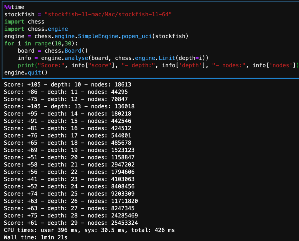
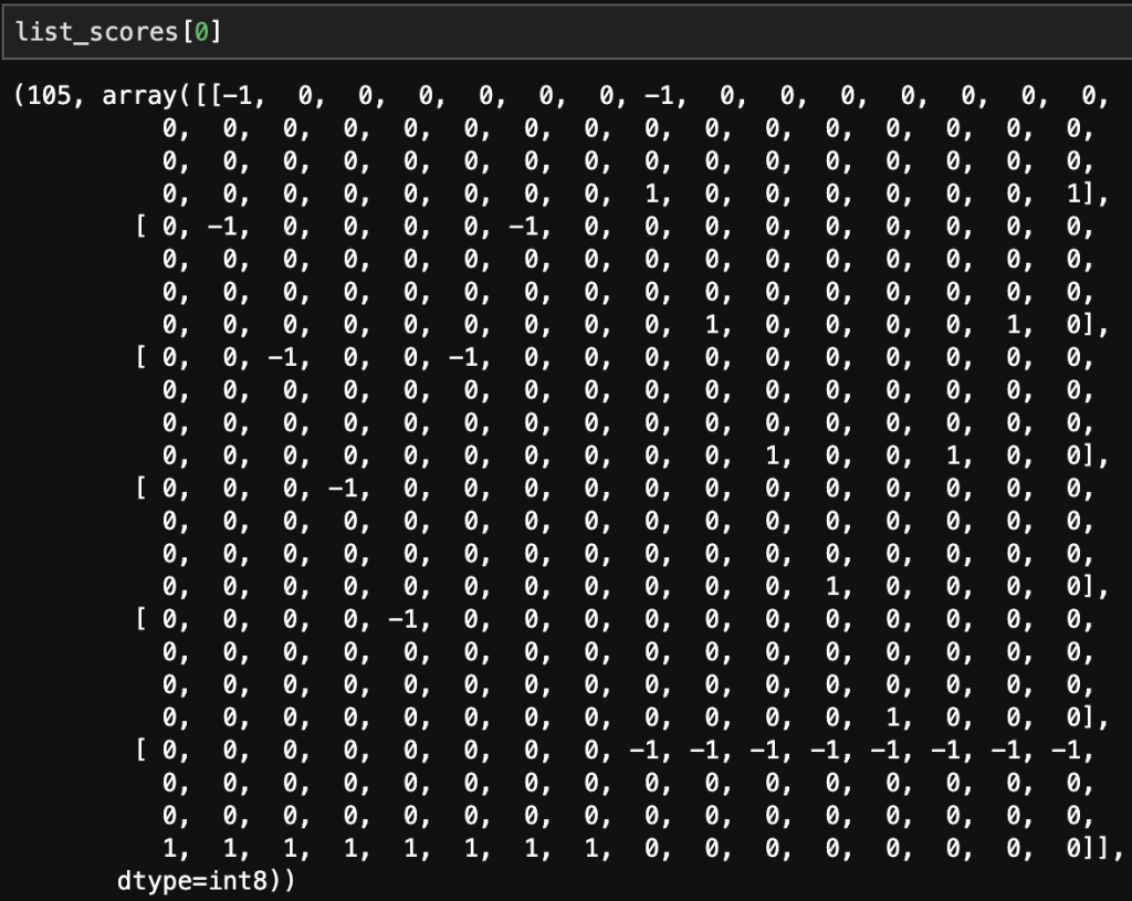
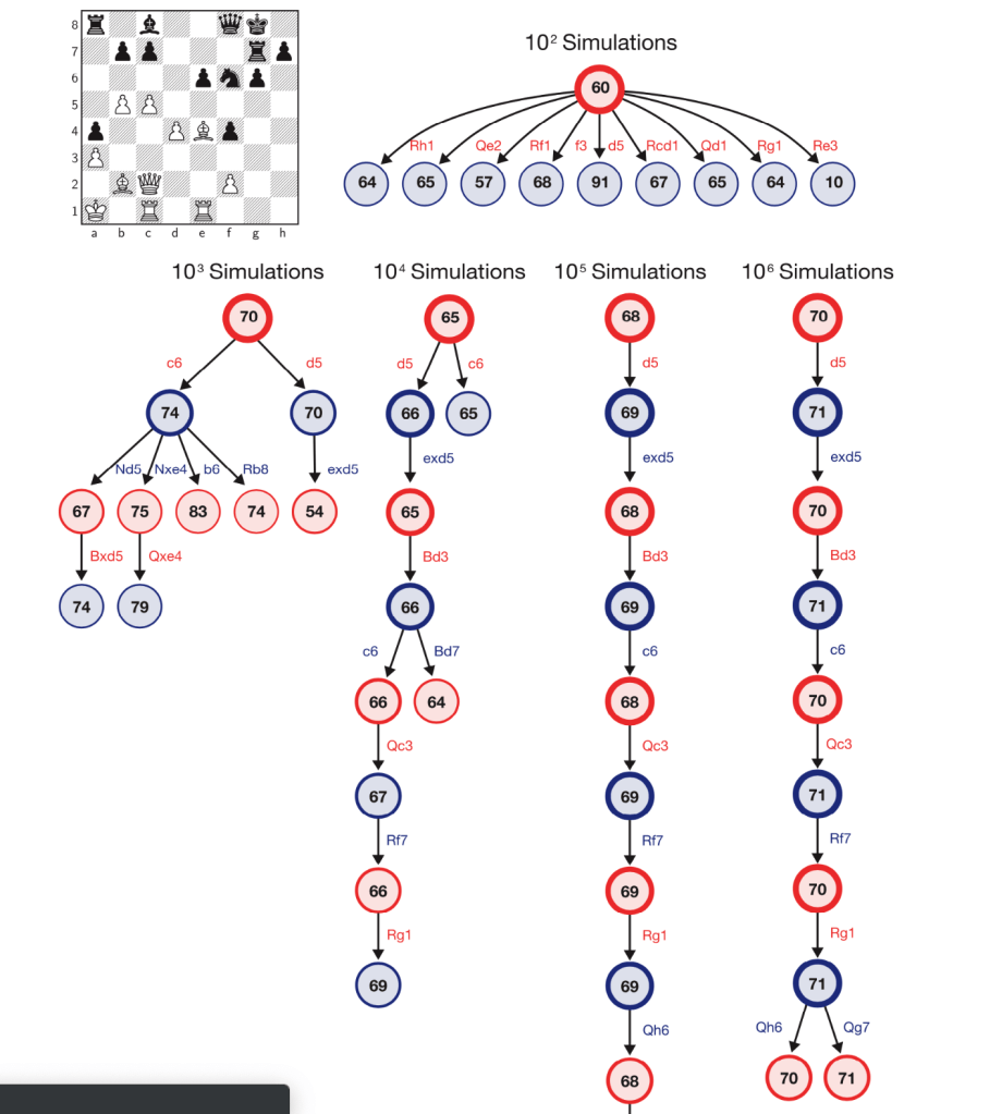
My approach, to this challenge involves incorporating Stockfish’s open chess engine for evaluating the positional value of the board, this will be my target variable for training my models. The features in the dataset will be the position of each piece arranged on a collection of 6 – 1×64 arrays, in bitwise format. This model will approximate Stockfish’s score without performing Alpha-Beta tree searches, which take a significant amount of time, as seen below – the deeper the evaluation the more nodes the tree search has to go through.
The board that’s being analyzed is the starting position from white’s perspective, so it is a very neutral board state.
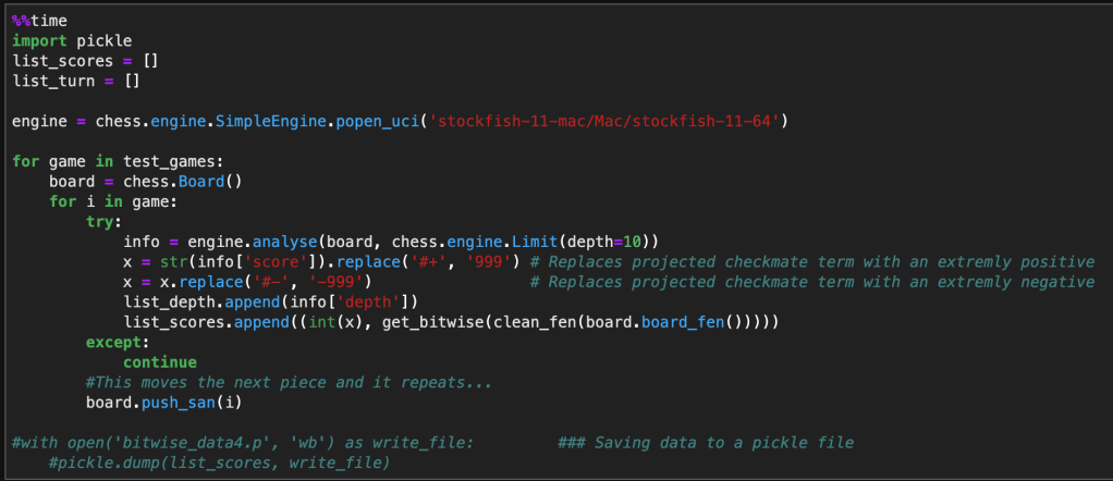
The following code implements the same chess engine logic. It iterates and evaluates through a nested for-loop looking at each move inside each game, while converting the current position on the board to a bitwise state. Note that I limited the depth to 10 in order to collect enough data in the time constraint I was operating under. In the next run, I’m planning on increasing this to at least 15, maybe 20. Although this will significantly reduce the amount of data I can collect, it will increase the accuracy of Stockfish’s evaluation, and will have a direct improvement on the accuracy of my model. I will combine this methodology with another insight to optimize data selection for training my model.
Below is a single sample of how a single board state evaluation looks like. The first value being the score evaluated by Stockfish and the 6 – 1×64 arrays correspond to the position of rooks, nights, bishops, queen, king, and pawns. The negative indicates a black piece and a positive indicates a white piece.
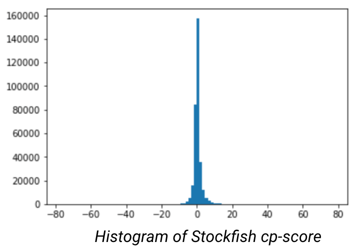
After doing data preparation and modeling, I occurred to me that the model was overfitting on neutral positions (between -1 and 1), this is problematic. When looking at the histogram of the evaluated scores, it became obvious that there was significant kurtosis. In order to improve the model I would need to under sample the neutral moves to place greater emphasis on the good/bad positions.
However, when you reduce the dominant class the amount of data at your disposal will drastically reduce the number of data points at your disposal. Combined with the bottleneck of data creation (through StockFish), I will have to create a nuanced approach to selectively chooses moves that mostly correspond to good or bad moves.
After creating the model on a subset of the better quality moves there was an increase in the evaluation error, but the model didn’t overfit. It also appeared to begin to understand each pieces movement, but would get lost in the dimensionality and still make blunders that would be obvious to a chess novice.
This project appears to have no end in sight, but through the troubleshooting process, I am gaining a considerable amount of insight into how AI learns and process information. As well as how programs can be integrated with Python to further enhance the capabilities of the language.
History/Predecessor:
Created by DeepMind, who were bought by Google in 2014, AlphaZero is child of the explosive popularity of AI, the desire to create the ultimate chess engine, and raw computing power. The creators, inspired to create a versatile AI that would dominate chess, Go, and Shogi. The premise being that they would only bound by the potential of AI, the rules of the game, and having no training on the moves of human opponents. To accomplish this, they trained for 24 hours on 5,000 tensor processing units, that were specifically developed for neural network learning. From those generated games they utilized Monte Carlo simulations that would score the results of sequential moves, and generate a “reward” that would score the potential outcome of the move. This decision, regardless of how pivotal the move, completely alters the game. And would require a new permutation of moves. It has been calculated that the game tree complexity of chess to be 10^123, this number is larger than the number of atoms in the universe. Being able to select the best move through brute force takes an insane amount of computational power. By training AlphaZero through Monte Carlo simulations, it reduces the number of computations down to 80,000 moves per second which is a fraction of the 70 million that Stockfish requires, arguably the most competitive engine next to AlphaZero. In spite of the computation deficiency, Alpha evaluates its position better and routinely beats StockFish When attempting to level the competition by reducing the amount of time for Alpha, it was only when Stockfish had 30 times the amount of time per move that Stockfish started to excel.
In regards to it’s versatility, not only has Alpha outperformed the best chess players and engines, it has also out performed similar type games Go and Shogi. Although Alpha carries the crown for the ultimate Chess AI, Deepmind wanted to create an AI that would excel in a plethora of board games and basic video games. This new AI would be called MuZero, while its not the main focus of this blog, it is astonishing that such a versatile AI could be made to nearly master a large amount of games.
The Engine Under the Hood:
What makes AlphaZero so good? DeepMind restricted the learning of the Alpha to only legal moves and only allowed it to train on its own simulated games. Both of these parameters penalized the training process by not allowing it to learn opening moves, and greatly increased the computational expense.
Monte Carlo Tree Search:
Through reinforcement learning, the AI will generate all possible moves and generate a score on how advantageous the move is. It will then branch out and continue downward on the tree evaluating each move at the next state. This process repeats until the AI reaches its defined limit or reaches the desired state, a win. At this point the program retraces its steps and reevaluates the assigned scores at each state, and selects which move to make based on how to reach the best score.

How Does it Evaluate Position?
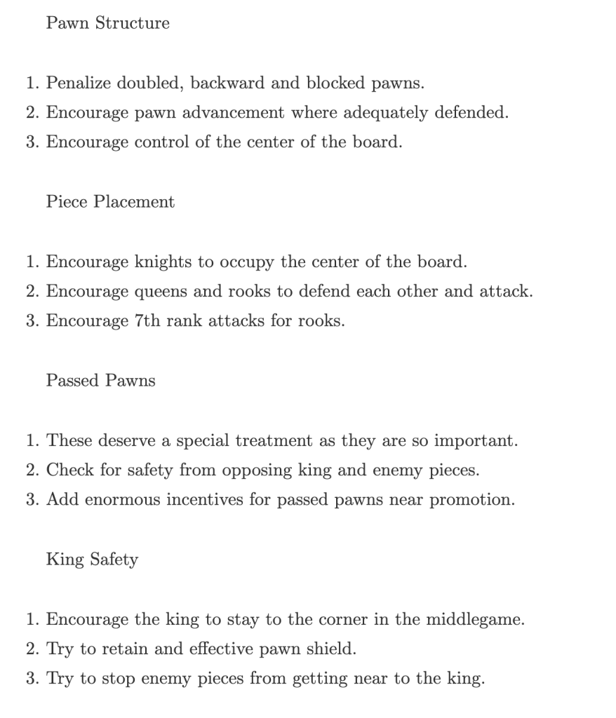
Not sure. However, I’m sure it is proprietary. Another highly competitive engine, Stockfish, is an open-source project that we’re able to take a closer look. From http://rin.io/chess-engine/, the author outlines the criteria for evaluating each positional instance.
Reception:
Being able to evaluate such a long string of moves gives AlphaZero a unique play style that befuddles event the most accomplished chess players. A quote from Garry Kasparov, one of the best chess players of all time, best describes the nuances that make Alpha so special.
Programs usually reflect priorities and prejudices of programmers, but because AlphaZero programs itself, I would say that its style reflects the truth. This superior understanding allowed it to outclass the world’s top traditional program [Stockfish] despite calculating far fewer positions per second. It’s the embodiment of the cliché, “work smarter, not harder.”
AlphaZero shows us that machines can be the experts, not merely expert tools. Explainability is still an issue—it’s not going to put chess coaches out of business just yet. But the knowledge it generates is information we can all learn from. Alpha-Zero is surpassing us in a profound and useful way, a model that may be duplicated on any other task or field where virtual knowledge can be generated.
In the theme of expanding my data science toolbox, in this blog I will be exploring a few products, provided by Amazon, that are commonly used in data science.
At the time of writing this, I had recently gone on a tour of company that conduct large scale data exploration and I got an overview of how data moves throughout the company. I felt a little overwhelmed by the list of products they used and how they were related and how they fabricated insights through this pipeline. After wrapping my head around this schema, I noticed that a significant number of the products were provided by AWS, and realized that this wasn’t going to be the last time that I would see them.
AWS currently offers 175 cloud based services, geared towards all different cloud based services that a company could want. I just wanted to pick and choose a few that seemed applicable, and become familiar with their functionality. As well as a couple that peeked my intrest.
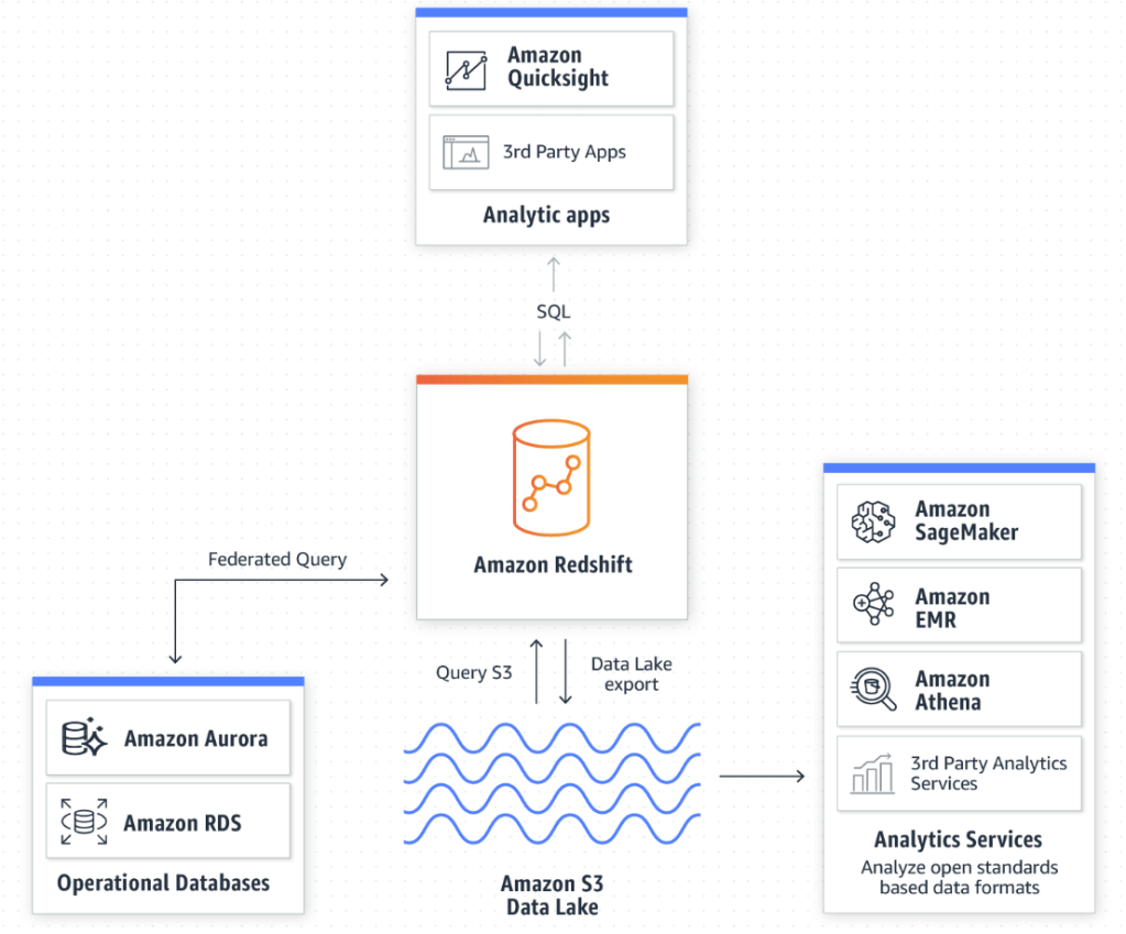
One of the more straight forward products Amazon offers. It can be comprised of both structured and unstructured data, the later is more common. It’s primary use is as storage space for your companies data lake, and is essentially a highly-scalable cloud storage platform with a focus towards interactivity between other AWS products. Such as security products like AWS CloudTrail or data warehousing products like; Redshift, RDS, or Aurora. There are a few different variants that cater to the particular needs that companies face, like S3 glacier. Which is an archive service with lower cost, but comes at the expense of response time, ranging from minutes to multiple hours. The items stored on S3 are referred to as objects and are limited to 5TB or less per object. You can access the objects through REST API, Software Dev Kits, or other Amazon query methods. In our daily lives as a data scientist, S3 will most commonly be a source of collecting data. It could be in a raw form that requires coercing to get usable data for analytics, but more often than not, companies won’t want to waste space on unnecessary data. Depending on the size of the company and frequency of the data pull, this data could have already been formatted, and inputed into some sort of database.
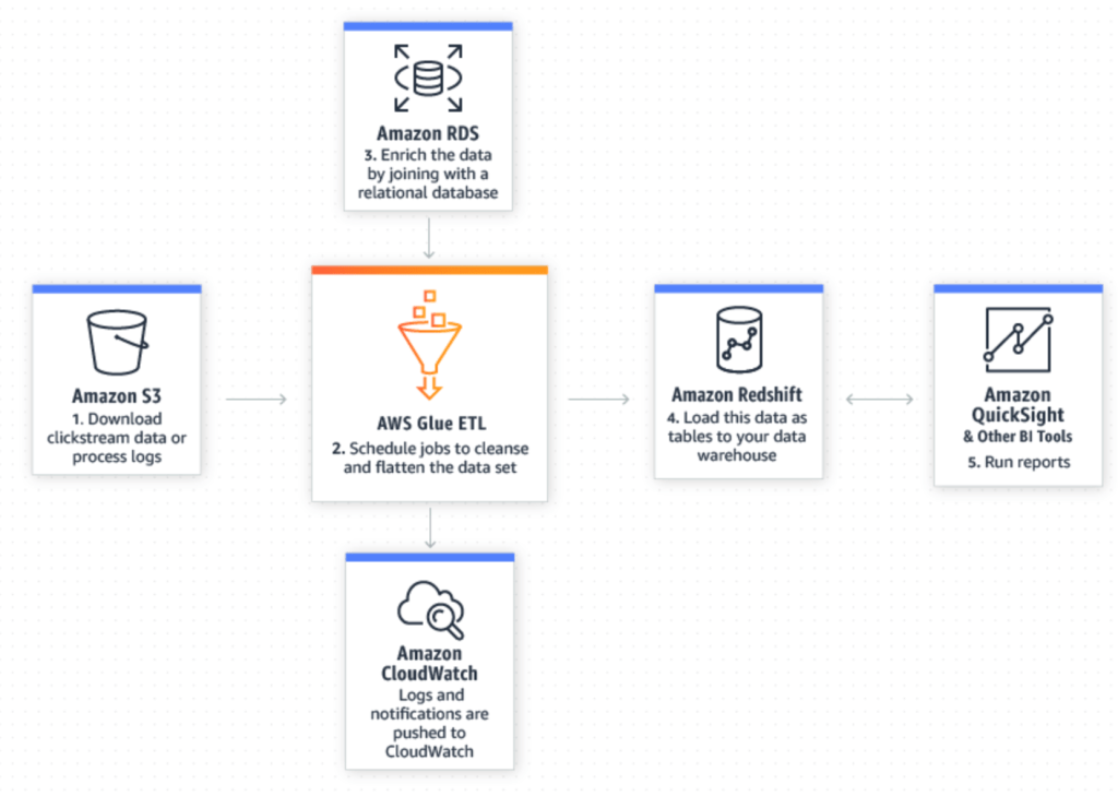
AWS Glue is an extract, transform, and load (ETL) tool that enables us to more effectively pick out and homogenize data across multiple AWS services using metadata. By doing so it allows us to query and analyze new data much more efficiently. The illustration below, from AWS does a good job showing how new data in your S3 data lake can be seamlessly merged with existing data in a relational database to yield refined data that is ready for further preparation and analysis in Redshift and other utilities.
Amazon Athena is a SQL query tool for S3. Because of that, it’s arguably the easiest way to explore data inside of S3. The best fit for this tool lies in ad-hoc queries, but when combined with AWS Glue, we’re able to enrich the S3 data with other sources to reach meaningful conclusions using simple SQL queries and pumping it into Amazon QuickSight, Tableau, or other data interpretation tools.
Amazon Redshift is a centralized repository for processing structured and unstructured data. This is where a bulk of our time is spent as data scientist. Then we can export it back to S3 for further analysis, or Amazon Quicksight to display your findings. One of the biggest advantages to utilizing a cloud computing platform like AWS is its ability to handle extremely large amounts data. Without it, our large queries and data processes would take an exhaustible amount of time, provided your computer doesn’t reject the request.
Amazon Timestream is a unique database service that stores data in set time intervals. As an effect, it is optimized to run 1,000 times faster than conventional relational databases, and can process the new queries down to the nanosecond frequency. Real life data is always developing and fractional seconds count. Being able to collect and analyze your data, and create actionable responses as efficiently as possible is extremely valuable. The article below from the Motley Fool outlines the lengths high-frequency traders went through to obtain 1-billionth of a second advantage over fellow traders.
https://www.fool.com/investing/general/2016/02/23/the-absurdity-of-what-investors-see-each-day.aspx
Amazon RDS – Is a hosted database service that enables data exploration inside of Redshift. Amazon allows the customer to choose between these engines to run queries off of:
Amazon Aurora – Is a cloud based relational database engine that is 5x faster than standard mySQL queries, but maintains compatible with mySQL and PostgreSQL.
Amazon offers a lot of products. A lot of those products seem to do similar things, but they all seem to have their niche in Amazon’s product line. As needs emerge for Amazon customers, it is evident that Amazon has the resources to evolve and incorporate this into existing products or develop an entirely new tool to deal with this need.
What are Real estate investment trusts?
Real estate investment trust aka, REIT’s, are companies that own/manages real estate. REIT’s are a great alternative to actually buying a physical property. They are required, by law to distribute 90% of their income as dividends and as a direct result they typically have some of the highest dividend yields among publicly traded assets. There is definitly more to know when it comes to REIT’s, but for the purpose of this blog. All you need to know is that REIT have relatively large dividends, and I want to look how this effects the time series decomposition and future projections.
Where did I get the data from?
Alpha Advantage, they have a really easy API to access and whenever I need/want quick, easy, and clean market data its very accessible.
What REIT did I choose?
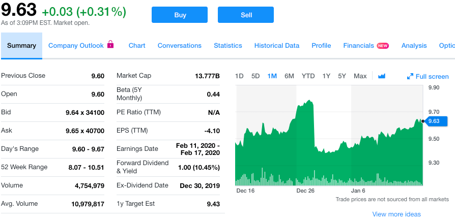
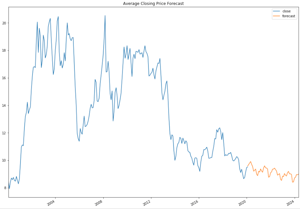
Annaly (NLY), as of 1/15/2019, they are priced at $9.63 per share, and yields a yearly dividend of $1.00, or 10.45% yield, making quarterly distribution of $0.25. I hypothesize that we’ll see significant movement in the seasonality around the dates where investors are locked into each quarter’s dividend payment. This date is also known as the ex-dividend date. This will hopefully allow us to better forecast future result. I selected them because of the significant size of the dividend, and figured it would give me the best chance at seeing any phenomenon, if there is one.
The process
First I started with obtaining the data through an Alpha Advantage API, in JSON format. Next, I proceeded with reformatting the data to capture the average daily move, measured over a month.
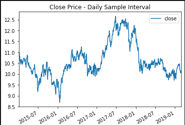
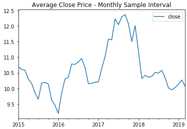
Resampling the data over a month duration, allows us to more easily see the signal, and reduce the residuals. After which, I performed a Dickey-Fuller test to determine whether or not the price history was stationary. Since it was greater than the critical value I was attempting to be under, I needed to perform differencing in an attempt to make distinctions from the data. After re-running the test, I was well below the critical values and could proceed with checking the decomposition plots.

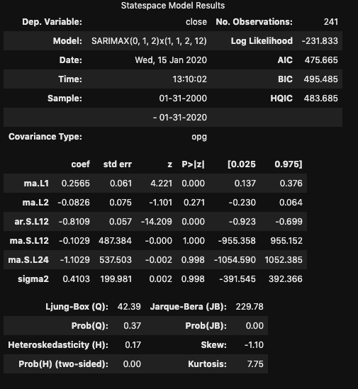
From these plots, I was able to notice a distinct pattern in the seasonality of the pricing that occurred every 12 months. This (and the differencing) are important to note while considering the best SARIMA model. A quick look at the total and partial correlograms showed a couple of the moving average (MA) and auto-regressive (AR) terms that could be considered in the model. However, to figure out the best SARIMA model, I’d have to try a variety of terms and compare the AIC and BIC values for each model. I also tested a 3 month seasonality since I partially expected there to be a strong model reliant on the background expectation that the dividend would cause a drop in stock price every quarter. Turns out, the 12 month model recorded a better AIC. After creating the model, it is then possible to predict future events off of the model.
SARIMAX Parameters
From this model, I was able to generate predictions. One thing to note, the further you get from current data, the less accurate these predictions are going to be. So although my predictions go to 2024, these are highly based off of previous prediction values, and will vary significantly
Conclusion
Time Series modeling can provide a crude look ahead at future values. While ‘closing price’ is reliant on the previous day’s value, it is only a fractional piece of data. Trying to create a stock prediction model of a single feature will not yield accurate predictions.
In regards to the dividend, while it is evident that these distributions effect the price of the stock, it is significantly less important than prevailing trend of the stock.
Disclaimer
It should be understood there is no guarantee that past performance will be indicative of future results. Investors are cautioned that they may lose all or a portion of their investment when trading or investing in stocks and options.
Through the Flatiron school program, it’s typical that new libraries get introduced either in lecture or on Learn.co. However, this style of “spoon-feeding” new information is atypical in the real world, and in this career path, I’ve subscribed to life-long commitment of academia. This blog will follow the path I took, in learning IPywidgets, an interactive graphing library built on top of MatPlotLib.
I knew that I wanted to tackle a new visual library that expanded what I already learned, but I didn’t know which particular area. This predicament led me to the internet. After a few dead-ends, I found IPywidgets.
Why choose IPywidgets? Because its interactive! Instead of cramming too much data onto a single plot, or spreading it across a sea of plots and colors, we can allow the viewer to control what they see, and add value to almost any project.
Before jumping in and attempting to code, I looked at a few YouTube videos that walked through the basics, and outlined some of the features. I quickly learned that there was a plethora of widgets available that could be used to manipulate the code, in one form or another. The link below includes the current list of widgets available.
https://ipywidgets.readthedocs.io/en/latest/examples/Widget%20List.html
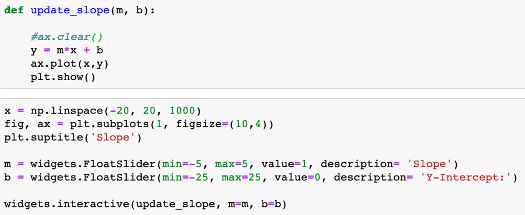
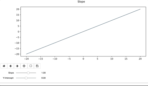
The one tool that stood, out was a slider widget. It could be moved to change variables and, as a result, drastically change the outcome of your graph. This seemed useful and practical, so I decided to attack this feature specifically.
In its essence, each slider widget changes a single variable in a function that modifies the output of a graph through the “widgets.interactive” method. This method passes the function to be applied to the plot as well as linking the slider items and the variables in the function.
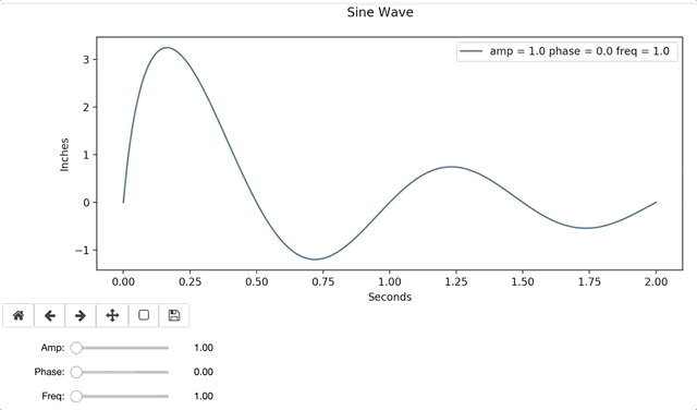
One of the easiest ways to see this in action is through a simple linear function defined by:
y = mx + b
To modify the line, we’d alter the slope, ‘m’ and y-intercept, ‘b’. When doing so, the interactive widget considers the change to the function, and re-plots on top of the existing. Ax.clear() removes the previous plot. If we forget to clear the existing plot, the interactive widget will continue to plot on top of the previous iteration. The result can be colorful and artistic, but more likely distracting and not advisable.
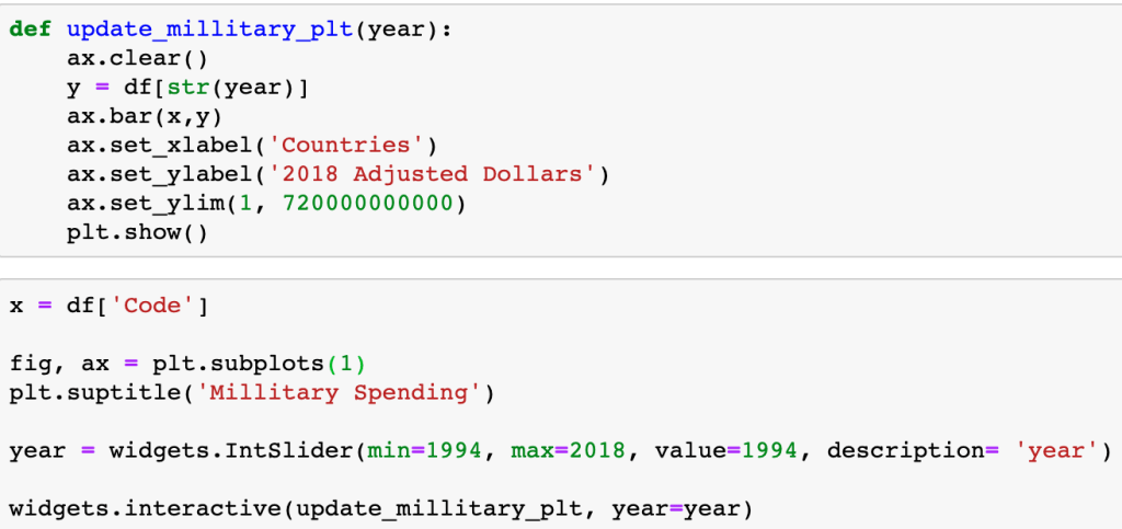
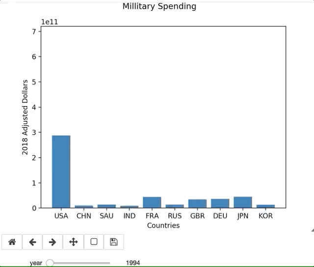
When accessing a Pandas Dataframe, you have to either setup the function to iterate through the table or, in this specific case, iterate through the table through the column header.
There are countless amount of variations in what you could possibly want in a graph, and there is no YouTube Tutorial that is going to help you through your exact error or issue. Being able to lean on the documentation is essential to learning new libraries. For example, I ran into an issue using widgets in Jupyter Labs. I originally thought the issue was syntax related, but the online documentation validated what I had. This permitted me to pursue other troubleshooting issues. Simply switching to a Jupyter Notebook resolved the issue. Since my primary purpose of this blog is to focus on the library and the learning process, I continued on a Notebook.
In the example below, I define a sine function with a dampening coefficient (1/(x+.1)). The function includes a legend, that will update as each plot gets created and removed.


Interactive widgets are relatively easy to use, after a little practice. Visuals are easily interpreted by many, and often bridge knowledge gaps. Interactive graphs provide hands-on instantaneous data exploration, even to those with no data science background, and are a resourceful tool for any aspiring Data Scientist.
